Recent Work / MiLu: Wednesday Lunch
Designing for the moment before giving up
2025
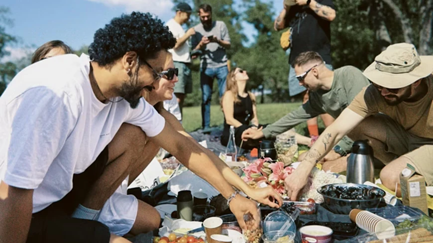
MiLu is a grocery delivery service concept built around a single insight: people don't fail at cooking, they fail at the eight exhausting steps that precede it.
Solo project for the UX Design Bachelor at Hochschule Darmstadt. Concept, research, service design, persona work, wireframing, from a late-night walk to the supermarket to a thirty-screen prototype.
Wednesday, 9pm, and the supermarket is closing
It's Tuesday night. I just sat down. Tomorrow is MiLu, our weekly Wednesday lunch, where all of us cook together at university. I'm in charge of bringing the ingredients for the curry. And I realise I forgot to buy half of them.
Coat back on. Twenty minutes I didn't have. The store closes in fifteen. That walk became this project.
MiLu, short for Mittwochs-Lunch, is a small ritual at our department: every Wednesday we gather, divide the cooking, eat together, talk for two hours. It's one of the best parts of my week. The cooking part is the joy. The getting-the-ingredients-there part is the friction. And the friction was always strong enough to make at least one person bail.
The problem wasn't cooking. It was the step before.
Cooking together at MiLu was never the problem. People genuinely wanted to do it. The bottleneck sat one step earlier: in the organising-and-procuring phase, where energy is lowest and decision fatigue is highest.
- — Someone forgets ingredients and runs to the store late.
- — Two people buy the same item because no one coordinated.
- — One person, exhausted from a long day, just doesn't show up.
- — The group settles for less ambitious dishes than they wanted.
I noticed something more interesting once I zoomed out: this isn't a MiLu problem. This is the same friction that decides, every weeknight in millions of households, whether someone cooks at all. Hungry, tired people don't fail at cooking, they fail at the eight steps that precede cooking. Planning. Listing. Going. Carrying. Putting away.
The service had to intervene before the critical moment. The moment people decide against cooking.
That insight reframed the brief. I wasn't designing a grocery app. I was designing a buffer between exhaustion and intention. Whether the customer was a tired student before MiLu or a tired engineer at 7pm on a Tuesday, the underlying friction was identical: too much organising, not enough energy.
My design thesis: uplifting, not transactional
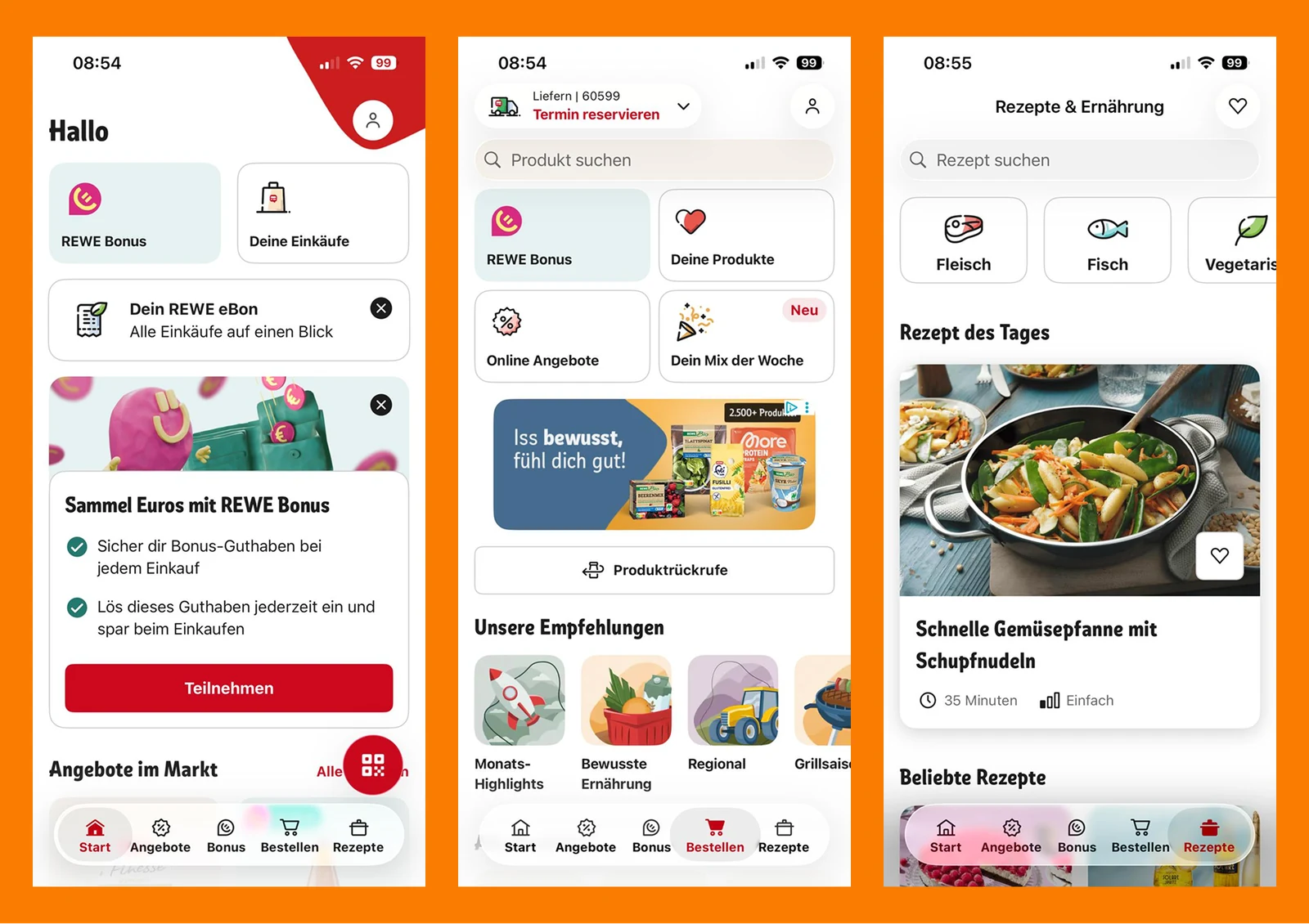
Most grocery apps treat the user as a logistics problem to be solved. Open the REWE app, the Flink app, the Lieferando-Groceries flow, and they're built around the question "how do we get items into a basket as efficiently as possible?". The interaction feels functional. The aesthetic feels procedural.
REWE treats grocery shopping as a necessary evil. MiLu treats it as the start of a good evening.
MiLu should feel uplifting, not transactional.
That single sentence became the filter for everything downstream. Tonality, copy, illustration, default flows, error states, even the placement of the cart icon, all of it ran through the same question: Does this give the user energy back, or take more away?
Three people, three internal conflicts
Generic personas didn't help me design anything. What helped was reframing each user not by demographics but by the internal contradiction they live with. Three archetypes emerged from the project, each carrying one unresolved tension that the service had to address.
The Relief-Seeker
High mental load from work or studying. Genuinely loves cooking, but experiences preparation as overwhelm.
“I want to do something good for myself, but I don't have the energy for it.”
Needed the flow to feel light: minimal decisions, no guilt.
The Spontaneous Coordinator
Often cooks for or with others. Last-minute decisions for groups. Carries the social weight of organising.
“I want it to work but I don't want to be the one who has to make it work.”
Needed delegatable control: easy to host, easy to share, easy to step back.
The Everyday Browser
Fragmented daily life. Food matters, but it's never planned. Decides situationally, not in advance.
“I only know what I want when I see what's possible.”
Needed inspiration-first navigation: show me dishes before you ask me what I want.
The whole information architecture was built to serve those three pillars in parallel, not in sequence.
How I worked: maps, hierarchies, and one stubborn question
I'm allergic to method-for-method's-sake. Every artifact I built had to earn its place by changing a decision later in the process. Three were load-bearing.
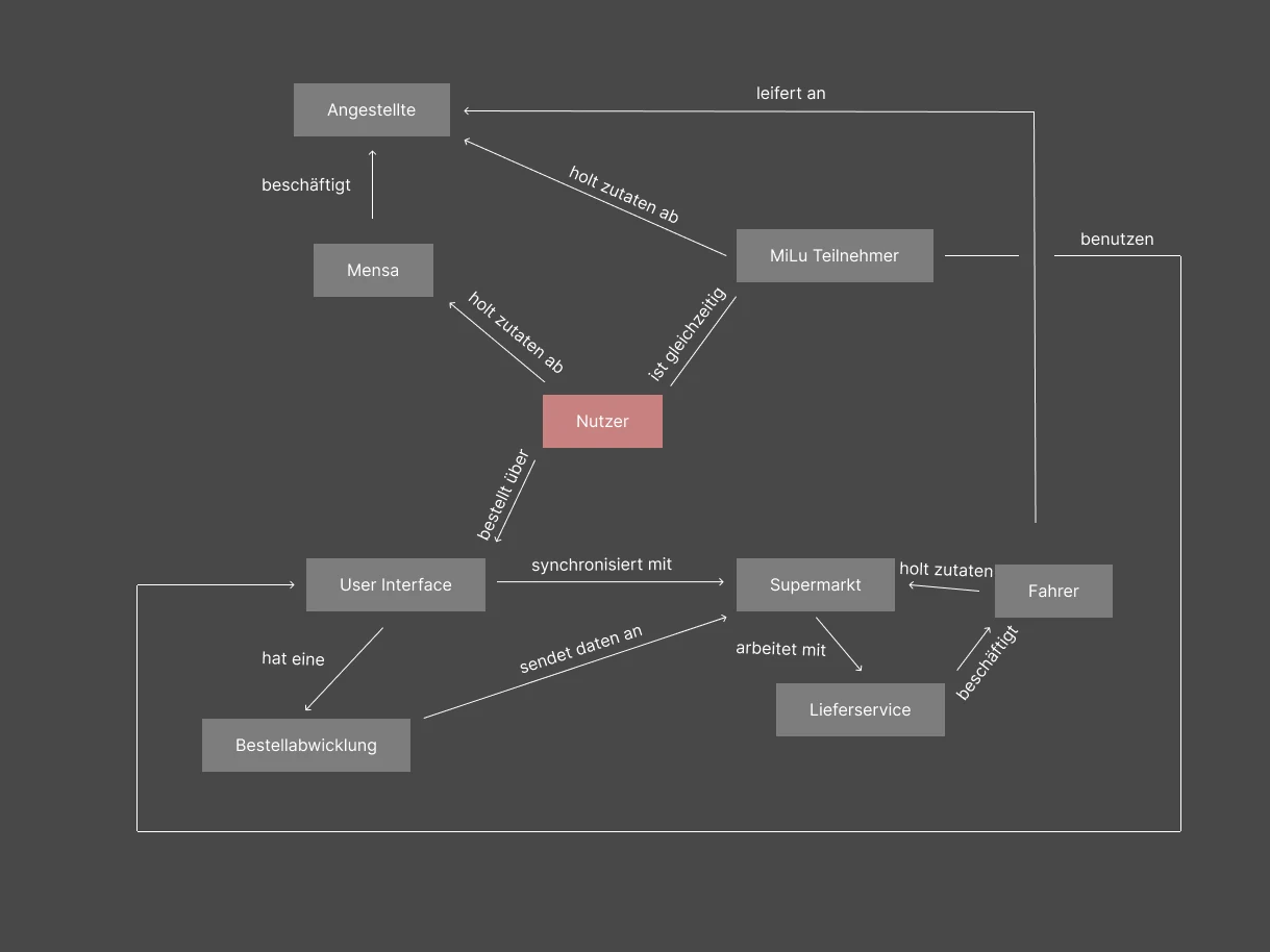
A stakeholder map: to find what I was not designing.
Before drawing a single screen, I mapped every actor: user, app, supermarket, delivery driver, MiLu group, university staff. The map's job wasn't to be comprehensive, it was to surface what the service does not control. I couldn't redesign the supermarket. I couldn't redesign the driver. What I could redesign was the small surface where the user makes a decision and trusts that everything downstream will work.
A needs-hierarchy: to find the real why.
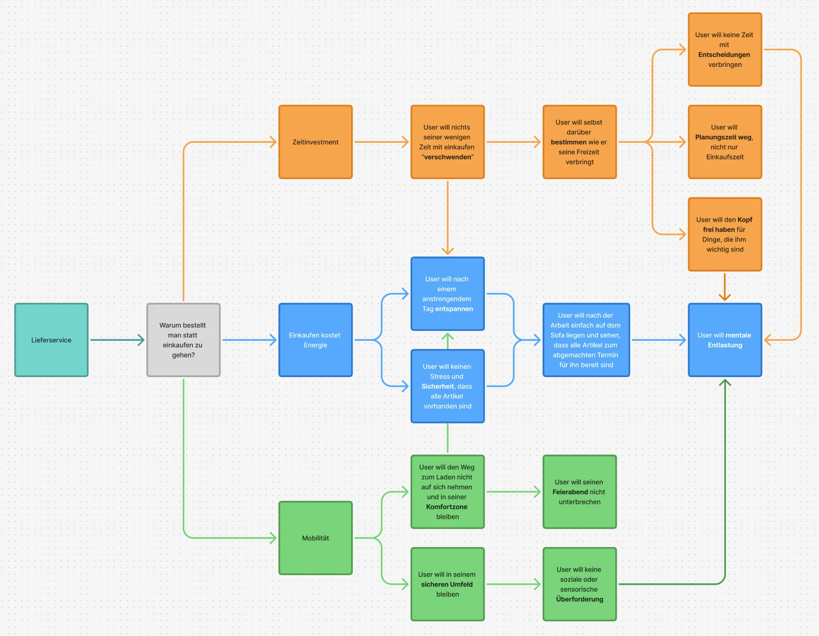
I worked backwards from a stubborn question: Why do people order groceries instead of going themselves? The answer wasn't convenience. Convenience is the surface. Below it sat energy preservation, control over free time, avoiding sensory overload, staying in the comfort zone. The hierarchy revealed that I wasn't selling delivery, I was selling mental relief. That word ended up on every wall of the project.
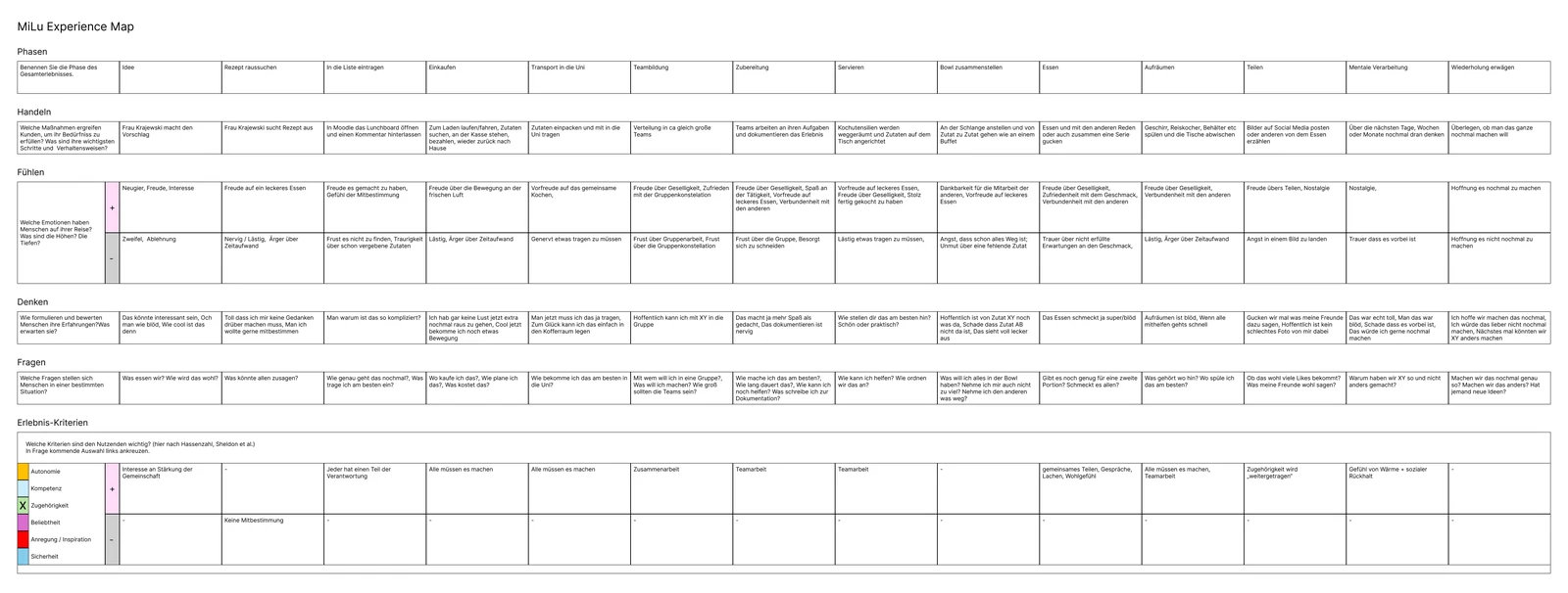
An experience map with feeling, thinking, and asking.
I used a structure adapted from Hassenzahl and Sheldon: every phase of the experience mapped against actions, emotions (high and low), thoughts, open questions, and the underlying psychological needs: autonomy, competence, belonging, being served or violated. Building it forced me to name the emotional valley moments, the places where a user might quietly give up, and design specifically against them.
From insight to product: choosing what not to do
Three concept decisions defined the product, and each one was a deliberate no to a tempting alternative.
Mobile app, not website.
The use case is a tired user on a couch, not a planning user at a desk. I considered three touchpoints: a responsive web app (lower barrier, but worse for repeat use), a WhatsApp-bot integration (zero install friction, but no inspiration surface), and a native app (highest friction at install, but right for the moment of use). I chose the app because the moments that matter (the post-work scroll, the half-second of "should I cook?") happen on the phone. Browse-while-tired needs to feel like Instagram, not like Excel.
Inspiration before search.
The home screen leads with curated dishes, not a search bar. The Browser persona told me people don't know what they want until they see options. A search-first home would have served the planning-minded minority and lost the rest.
A cook-list, not a basket.
The core artifact in the app isn't a cart. It's a cook-list, a saved set of dishes you can build, share with your group, re-order with one tap. The basket is a checkout step. The cook-list is a relationship. That difference matters because it shifts the product from one transaction to an ongoing rhythm, which is what MiLu actually was in real life.
REWE asks 'what do you want to buy?' MiLu asks 'what do you want to cook this week?'
Five screens that build the case
The full prototype runs to thirty-something screens. Five carry the conceptual weight of the product, from the first impression on the home screen through to checkout.
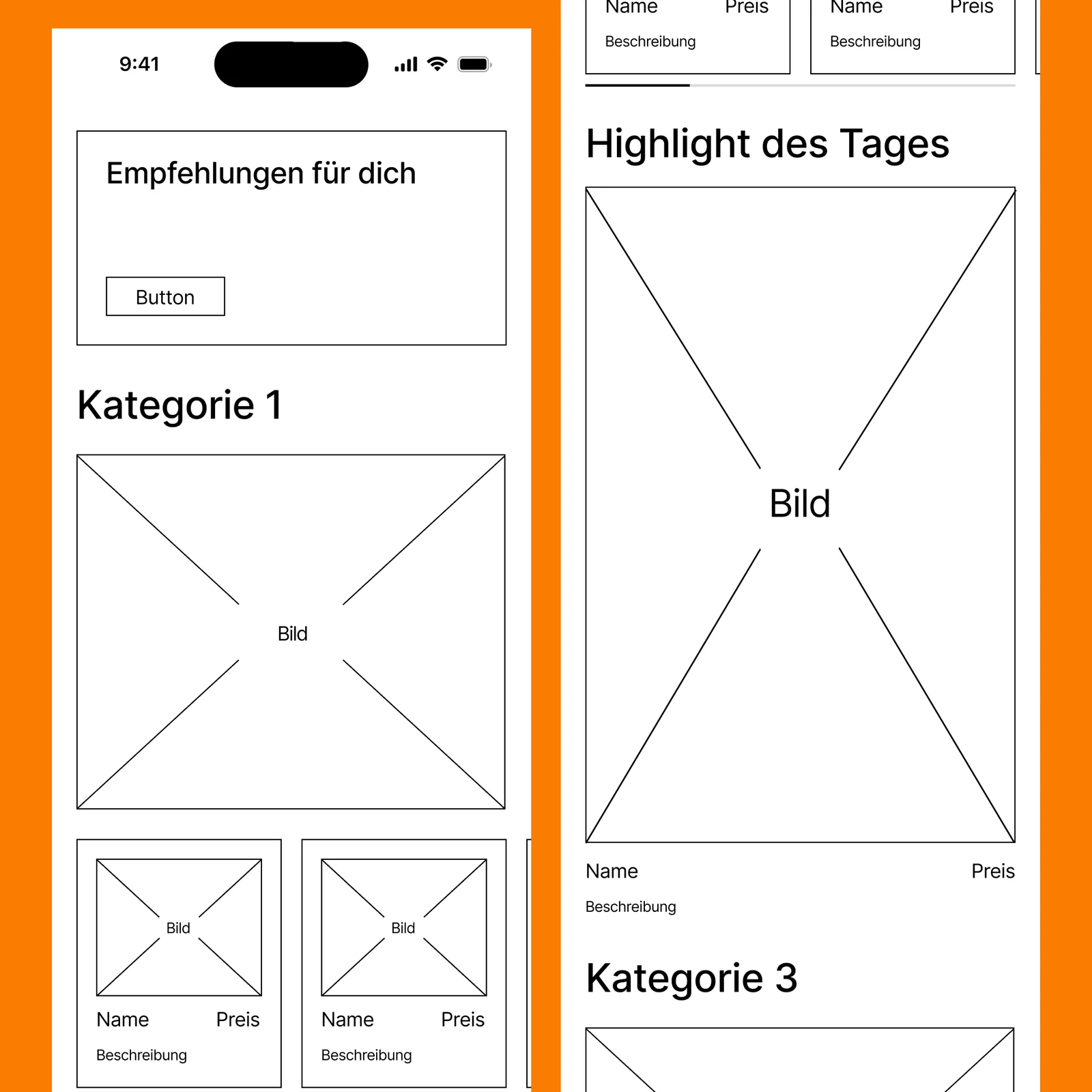
Home: inspiration as the front door.
The home screen leads with a single hero dish ("Highlight des Tages"), then three browseable lanes: Finger Food zum Teilen, Wenig Zeit?, Individuell bauen. Search is present but secondary, hidden behind an icon. The default state assumes you don't know what you want yet. That assumption matters: it removes the cognitive cost of having to decide before you arrive.
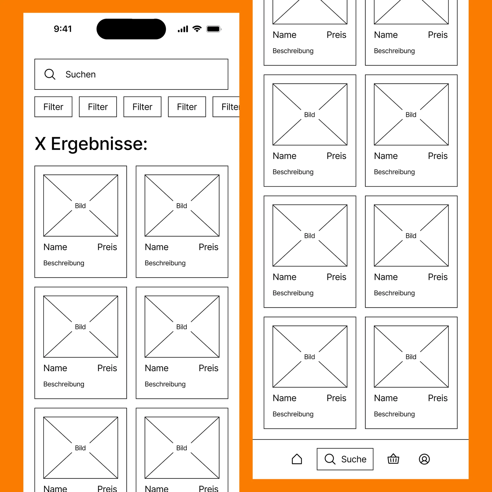
Search: a deliberate second-row feature.
Search sits behind an icon in the top bar, not in the primary navigation. The positioning is intentional: the default assumption is that the user doesn't yet know what they want. Surfacing search first would penalise the browsing majority to serve the planning-mode minority.
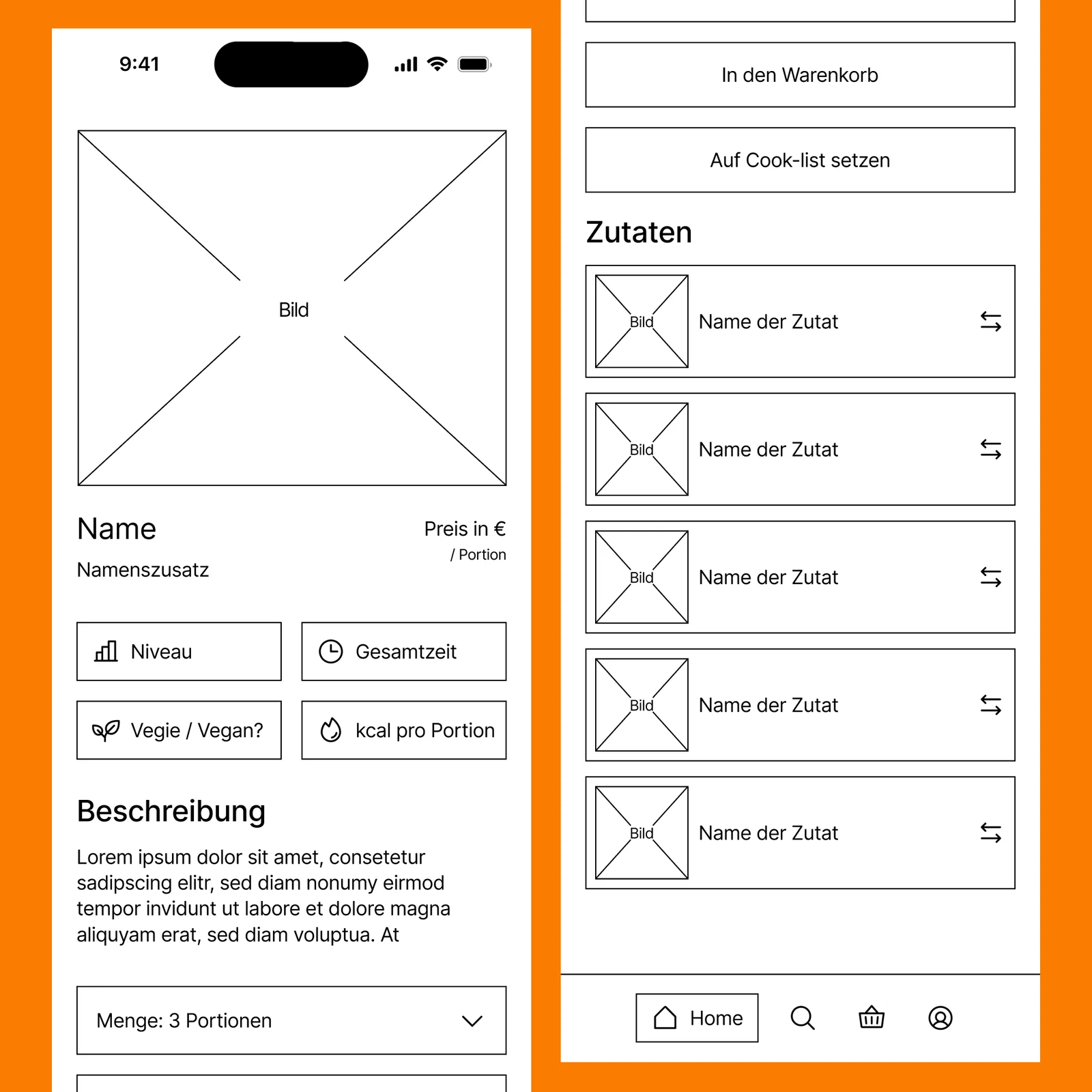
Dish detail: the moment of commitment.
Portion selector at the top. Then a clear single CTA: Add to cook-list. Below that, the full ingredient list, accessible but not in the user's face. The page is structured to make commitment feel light: pick the portion, add it, decide on the actual order later. No pressure to convert in this moment.
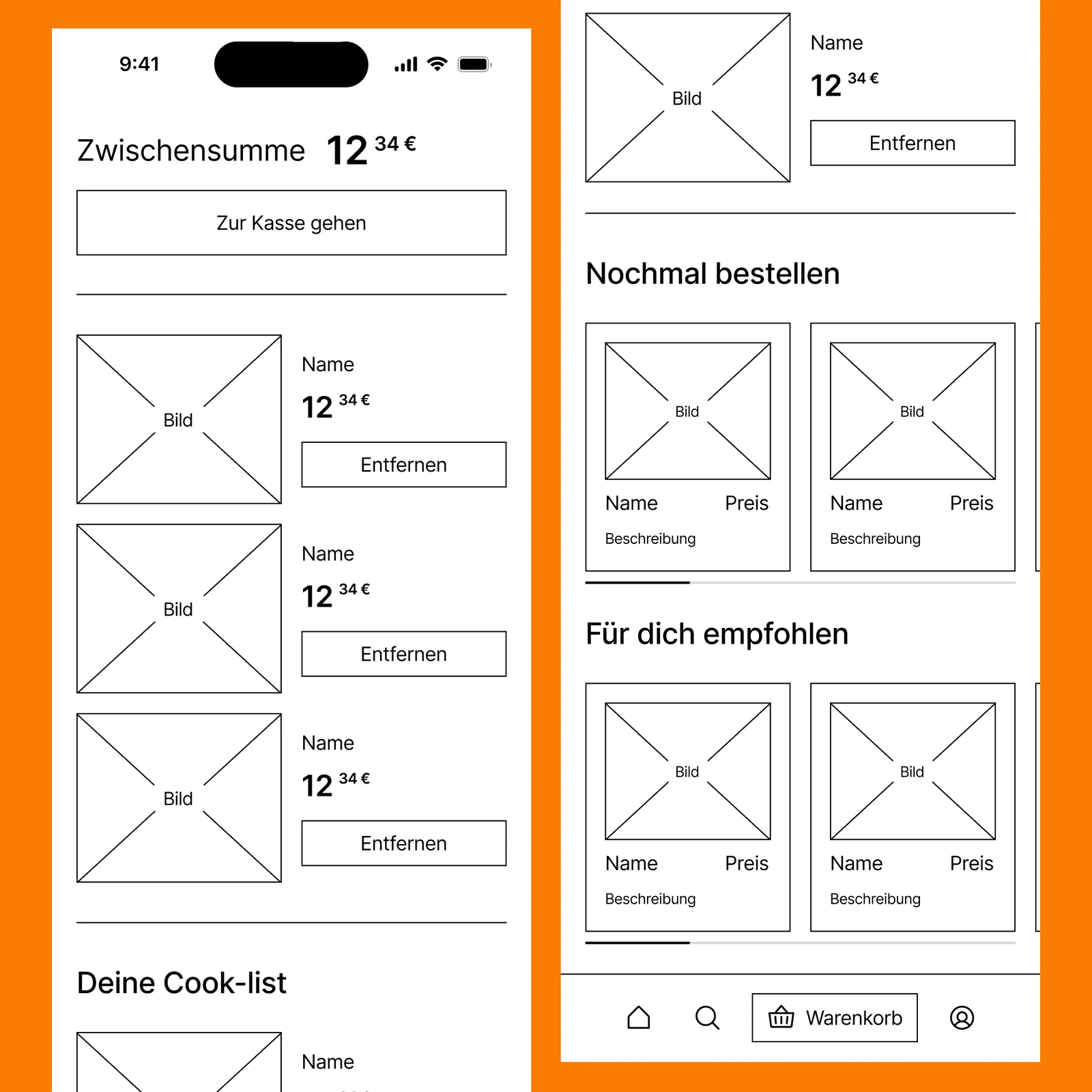
Cook-list: the artifact that makes the product re-usable.
A saved list of dishes for the week, with portion totals, a re-order shortcut, and a share function for groups. This is the screen that turns MiLu from a single-use service into a habit.
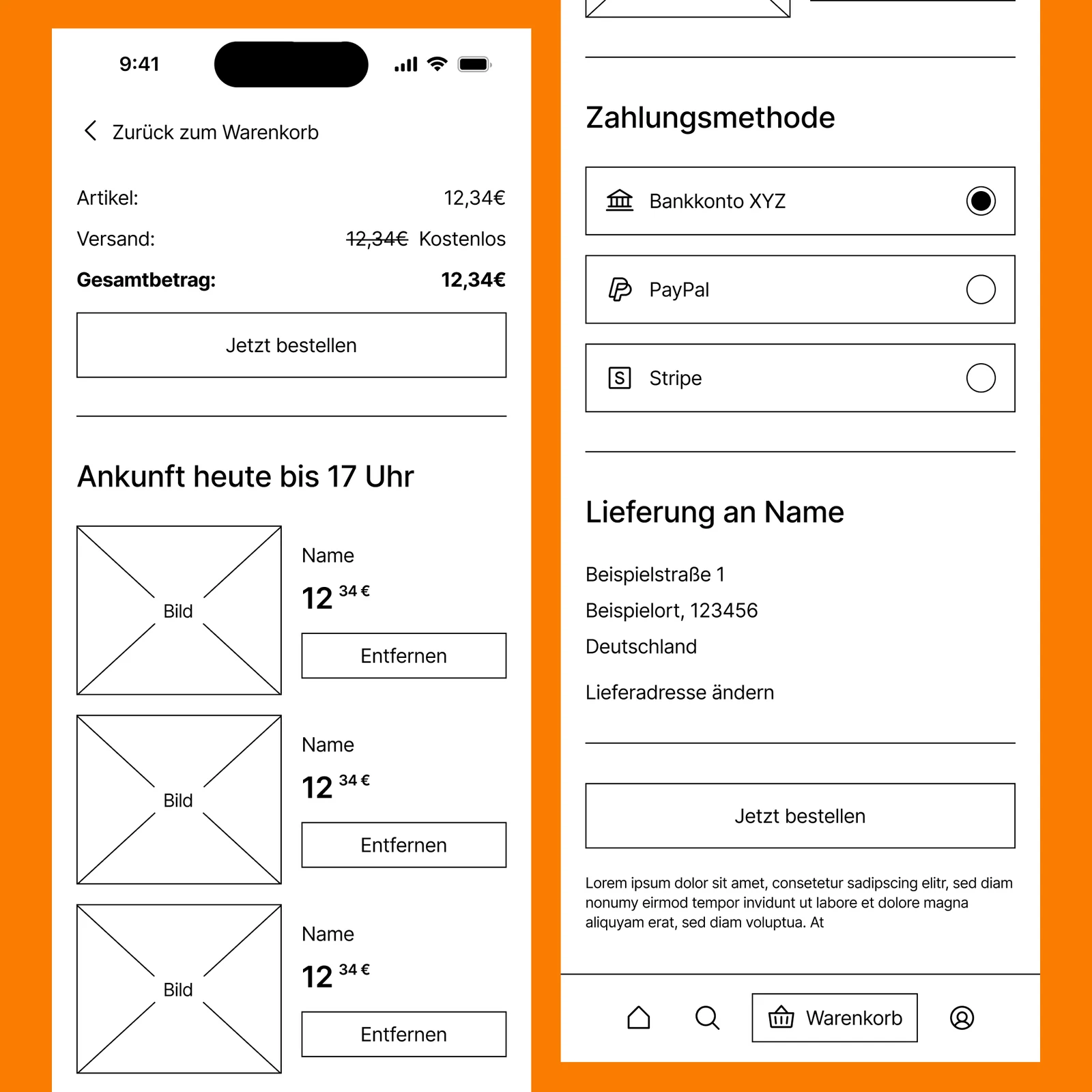
Checkout: only what the service actually needs.
Delivery address and time window. No upsells, no suggested additions. The Relief-Seeker persona was front of mind here, every extra decision at this stage costs energy the user doesn't have.
What this project changed in me
The biggest shift wasn't methodological. It was ethical. Designing this service forced me to look at every grocery app I use and notice the dark patterns I had been ignoring: the friction designed into delivery windows to push subscriptions, the emotional manipulation in "limited time" badges, the silent defaults that opt me into things. I started asking, with every interaction I designed in MiLu: what is this asking the user to give up?
User-centered design is the easy claim. Honest design is the harder one.
I'm also aware of where this case is incomplete. The personas were derived from desk research, my own MiLu observations, and conversations with classmates, not from formal interviews. If I were starting again, I would book five 15-minute conversations with real users before writing a single requirement. That single change would probably reshape the cook-list feature, the onboarding, and the tonality more than any other improvement.
A second open question I haven't resolved: AI is becoming default infrastructure in our field, but I don't yet know how to reconcile its environmental cost with the sustainability claims our industry likes to make. I designed MiLu without AI features. Whether that was a quiet act of restraint or just a missed feature, I'm still working out.
If I have ten hours to chop down a tree, I'll spend the first six sharpening my axe.
Hochschule Darmstadt · UX Design Bachelor · WS 2025/26 · Supervised by Andrea Krajewski and Sebastian Haase · Combined coursework grade 2.3